![]()
Gallery Photographers
Partner
Artists-in-Residence
Image City Feature Articles
Gary's Photographic Tips
Newsletter Archive
If you are unable to visit our gallery and would like to purchase photographs from this preview or others in the gallery, please contact the gallery and call 585-271-2540.
Gallery Picks of the Show
Through the Student Lens 2014 Peter Marr has chosen his "Picks of the Show".
click here to return to the details of the exhibit
All images copyright by the individual photographers
The East Gallery is indeed fortunate to have such an outstanding display by a gifted artist who has integrated pictorial and abstract art to perfection. I would have been delighted to comment on any one of Bruce’s superb images, for they all display their own particular visionary impact and exhilaration. I eventually chose “Bow Silhouette” to discuss further, because it brilliantly illustrates both facets of pictorial and abstract art, and clearly highlights the extraordinary vision and talents of a consummate artist. It would be intriguing that in an audience of High School Art majors, or even gallery frequenters, if the picture was left untitled, what percentage of these viewers would perceive the work as an abstract rendition, or the bow of a ship, or even both? For myself I strongly favor the latter, and I can easily add a third scenario by searching my memory banks for alternatives. It is perhaps the easiest conclusion that one is looking at a close-up of the graceful bow of a resplendent ship set against the majestic blue sky. Yet it is not difficult to imagine that you are on board a vessel, whose elegantly curved blue sail partially obscures the ornately painted side of a passing ship, or even a brightly colored wharf or pier that is racing by. The negative blue space occupies only about a third of the frame, hence most observers would favor that they are indeed looking at the curved bow of a ship. Of course, without assigning any pictorial recognition, it is relatively easy to imagine that one is looking at abstract art, though it is certainly more than an amalgamation of vivid colors, horizontal lines and a striking, elegantly curved vector. It is important to realize that in viewing any work of art, particularly in a gallery, that it is very unlikely that one has knowledge of what the artist’s intentions or thoughts are, so the onus on what one sees or wants to see is entirely the responsibility of the observer. I would be remiss if I did not comment on Bruce’s remarkable use of color and design. Never has black, red, green and blue been so gorgeously combined, and the interplay of horizontal lines and the dominant curve element is both powerful and dramatic. To crown it all, the myriad of diagonal striations in the green sector, exemplifying weather and wave action, together with the white highlight at the top right which gives a unique curve separation, are all added elements that contribute importantly in making this a truly visionary image. This is the most imaginative and thought-provoking image in the High School Exhibition, a print of poignancy, despair and hopefulness, one that every observer has to study carefully, and one that will certainly draw mixed reactions, the majority of which I hope are highly positive. The dark background has a series of lines of printed text, some words are highlighted in white or red so that they are more clearly legible. The words that stand out refer to both messages of despair, such as, shame, hating, cutting and self harm, whereas others relate to hopefulness, such as touched, strong, peaceful, hold on and best friend. Against this challenging backdrop, one sees an ordered array of hands and forearms, five of which have the hands orientated downwards, and five facing upwards. On the arms that appear reaching down, their is clear evidence of orderly razor blade cuts, the wounds increasing in severity from left to right. On the upstretched arms and palms of the hands, there are displayed inspiring messages, both compelling and uplifting, written in calligraphic handwriting, the beauty and elegancy of which impressively augments the texts themselves. It should be noted that disfigurement of the human body is a centuries old tradition, particularly among ethnic groups, who for example elongate their necks with metal rings, put discs in their lower lips, and stretch their ear lobes, to name just a few. These techniques are done, however, for beauty, for tradition, or many other reasons, not for punishment or humiliation . Without taking the time to discuss the reasons why left and right hands and arms don’t always align together, or why some fingers are curled inwards, or why nail polish is used in two cases, or why, most mysteriously, there are 5 hands and forearms on each side of an imaginary line, the important result is that all of this symbolism relates to young people who are in trouble, and the effort that is being offered to help them. The cutting phenomena is obviously just one representation of a problem, which could be the use of drugs or alcohol, anorexia, bulimia, bullying, violence, etc. The encouraging viewpoint is that there are people and organizations reaching out and up to support, comfort, and help those in trouble. To quote some of the beautifully written texts, “Turn your wounds into wisdom,” “You are loved and not alone,” and “Never give up on yourself, you will find your happiness, I promise.” This uplifting image is the creative and loving work of an artist whose clear message should be an inspiration to everyone, young or old, who have the opportunity to study it. David’s exquisite abstract prints range from scenes where the designs encompass rich, saturated colors, to those where more delicate hues interplay across the image surfaces. He challenges every observer to transcend the subject matter for its relevancy, and just concentrate on the image for what it may relate to. I was most intrigued by “B/A-5, ironically the only vertical print in David’s collection, because of the dramatic interaction between the quietness and beauty of a pastiche of subtle pastel shades, with the threatening nature of the dark rectangle at the center of the piece. The color palette of soft, delicate shades blend harmoniously with each other, creating a landscape that is timeless, as though each delightful element has coexisted seemingly forever. Yes, surface areas have suffered losses in places, and some areas have faded and had their hues diluted, but there is still a passionate integrity that holds all of the elements together, even though there is a vertical dividing vector that strives to maintain a more permanent division. Into this tranquil setting, a dark and foreboding intruder seeks to destroy the peaceful harmony that has endured for such a long time. Like the vertical fissure, this malefactor has a rigid line envelope, except for a tear in the upper right corner, and it represents a very formal presence, that markedly contrasts with the delicate patterns that surround it. In addition, one senses in the dark interior of this rectangle, horizontal stria and rapid movement, both of which are very unsettling, The overall response that I personally perceive from this print, is one of highly charged emotion, in which the quiescent normality is being undermined by an unwelcomed guest. An obvious, but unpleasant comparison would be life itself, say as in a human being, where the more gentle, normal ageing process is suddenly challenged by an unwelcomed intruder, one that is moving at a rate that is alarming to say the least. I am confident that in observing this intriguing image that the oncoming darkness will be quickly eliminated, and that peacefulness and normality will be restored. The artist has captured a powerful and imaginative scape, in which the large rectangular windows of the building that dominates the background, offers the viewer delightful reflections of the colorful facades of structures across the street, together with a glimpse of a much taller building, highlighted against a clear blue sky. The entire scene is framed by the massive concrete-step support, which allows one to enjoy all of the delightful series of diagonals, that interplay harmoniously with the strong verticals and horizontals. On its own, this charming slice of downtown is an excellent image. Dramatically, however, this interesting vista is interrupted by the explosive presence of a casually dressed teenager. Armed with roller blades, he has been captured by Jamey at the peak action point, as he launches himself over a series of steps, hopefully to land safely on the sidewalk below. We are aware that this scenario has been carefully planned, and that this teenager has done this act of bravado countless times. In no way does this take away from the fact that this is a superb action shot, where the use of a low camera angle heightens the drama. The observer should also be aware of a creative subtlety that may or not have been planned beforehand. I refer of course to the fact that the roller-blader has a complete disregard for safety equipment, no helmet or padding of any sort, although he hangs onto one of his rollers like experts usually do in attempting dare-devil maneuvers like this. Contrast this with the reflected image on the far right, in which a helmeted person, perhaps a fellow blader, has his arm raised and hand extended, as though acknowledging the extreme feat of our hotdog teenager. This is truly a great image, with perhaps a hidden safety message, that has been expertly seen and captured by the author. In commenting on this exceptional image by a High School student, it is appropriate to suggest a cropping change. The white sky at the extreme left top should be eliminated by bringing the left hand side in a little and lowering the top just a bit, the latter move also eliminates a highlight, probably a small ceiling light. These steps tighten the picture, enhancing the drama of the leaping teenager as he creates the most powerful imaginary diagonal in his quest to reach the street below. Many congratulations to Jamey for this great image. 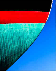
Bow Silhouette
Bruce Bozman
Pain and Beauty
Tychianna Glenn, Wheatland-Chili High School.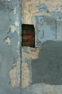
B/A-5
David Ridley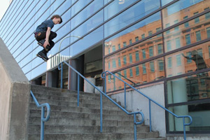
TY
Jamey Wilder, Wheatland - Chili High School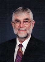
Peter Marr
We are very grateful to Peter for his thorough review and selection for Peter's Picks. Peter was born in England in 1935 and came to live in the United States in 1968. He worked for the Eastman Kodak Company for 34 years, retiring in 1998. During his employment and continuing into retirement, he has been an enthusiastic photographer. His photography has won him numerous awards throughout Kodak and in International Salons, including 5 George Eastman Medals, which is the top honor awarded to the most outstanding picture in the Annual Kodak International Salon. He has served as a judge in both local and international photographic competitions for the past 20 years, and is a Past president of the Kodak Camera Club and past chairman of many of the Kodak Camera Club organizations. In the past five years or so, he has devoted his photographic skills and interest into nature photography, notably bird photography. His bird photography has been the subject of several one-person exhibits, the most recent being at Ding Darling NWR, in Sanibel, Florida, The Roger Tory Peterson Institute in Jamestown, New York, and at the Webster Public Library in Webster, NY.
Image City Photography Gallery ♦ 722 University Avenue ♦ Rochester, NY 14607 ♦ 585.271.2540
In the heart of ARTWalk in the Neighborhood of the Arts